
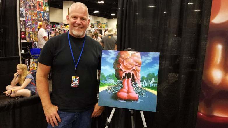
 We had the opportunity to interview Tim Jacobus. He is best known for illustrating the covers of the popular book series Goosebumps. Be sure to check it out, only at Conventional Relations!
Going back to the beginning of your career, what inspired you to first start pursuing art, specifically illustration?
My father knows how to draw, but he didn’t consider himself an artist. He would just draw to demonstrate something or show something like “Oh I’m gonna build a deck in the back of the house and it’s gonna look like this.” So when I was a kid, I thought that everybody could do that and that was just a natural extension. Drawing in our house was something that we did, but when I was a kid it wasn’t something that was talked about – art as a career. Art was something you did for fun and you know you never looked at it as a career. It wasn’t until I was 18, I was a senior in high school and I was ready to go to college. I had some art classes, but I didn’t really know where I was going with it. I had to fill some time in my schedule, so the suggestion came to get on a bus and go to the trade school down the street in the morning. It was a new program and they taught commercial art there. It changed my life
Where are you from?
I’m from New Jersey. Morris County vo-tech had a guy who was teaching commercial art and that just changed everything for me. I spent a few weeks there and went home and told my father, “Look, I know I said I was going to college for [something else] but I’m changing my mind. I want to go to art school.” He wasn’t happy about it. He was like “I want you to go to regular college. I don’t want you to go to art school.” The guy who was my instructor at the vocational school was an ex-World War II guy. He was tough around the edges and he said “Listen, I’ll talk to your father.” He called my father. They met in a bar, had a couple drinks, and he said “You know, your son has got some talent. This is a real career. This is not something that is fly-by-night. This is a real thing.” My father came home from that and said, “Okay, Frank says it’s okay for you to go to art school. I’ll back you up. You’ll go to art school.” So that’s the beginning of taking art from just something I did for fun and making it a career.
How did you first get involved with the Goosebumps series?
I had done books for Scholastic over a couple of years: about five years worth and I had proven myself to be responsible. Give me a job, I’ll do good work, and I’ll get it done on time. Getting work done on time in the book business is as important as doing good art. So when the series came along, they knew I was dependable. They didn’t just pick me. They picked me and another guy named Jim Thiesen. I did book one and Jim did book two. “Welcome to Dead House” was mine and “Stay Out of the Basement” was his. They wanted to see how each one panned out. At the end of it, there was a real fear of these books being too scary for the genre and when I painted mine, they had the vivid bold colors in it. They were like “I think that’s the angle that takes a little of the edge off the horror.” At the time, I didn’t know Goosebumps was going to be hundreds of books. R.L. Stine said it got off to a pretty slow start and they weren’t selling well. This was prior to the internet. Then, all of a sudden it started to take off simply by word of mouth. Kids telling other kids, “This is cool.” By the sixth book, it really started to ramp up.
What was your artistic process for creating the covers?
The way it worked is, R.L. Stine was writing the books at the same time I was doing the covers so I didn’t have a Goosebumps book to read. I would get a short synopsis about what the book was about and a couple sentences all the way up to maybe a couple of pages, but generally one paragraph. But that was enough. He’s very descriptive in how he writes and I would do three separate sketches. First I would do thumbnails which are scribbles for me, cover up a couple of pages and then I would pick three of those ideas out and draw them out 8×10. Back then it wasn’t digital, so I would fax my sketches over. They would all look at the sketches and pick one. Sometimes we took stuff out of one sketch and put it in the other. There was a little crossover, but generally they just picked one and we went to final and then I would go approximately 20×20. The final art was painted using acrylic paints and airbrush.
Did you have free creative reign over what they were going to look like or did you have notes from the publishers or R.L. Stine?
Once they approved the sketch, we were rolling and I just had to finish the painting and then once in a while there were just a couple of minor corrections. On “[The Horror at] Camp Jellyjam,” there’s the counselor in the foreground and there’s two buildings behind him. When I first painted that, they were more like single-story log cabins, but R.L. [Stine] had written something in the story about them being multi-story, plain white buildings so they gave me the painting back and I made them multi-story plain white buildings. It was those kind of changes so a cover would match the story better.
You mentioned getting stuff done on time and being that Goosebumps was a series where new books were coming out on a monthly basis, how long did you actually have to create the covers?
I would try to finish them in a week because I couldn’t just survive on Goosebumps alone. I had to do other books as well, so the idea was to do one book a week for a month and for the most part it worked very well, but every once in a while something would get in the mix and the famous story or the infamous story that I tell is about “A Night in Terror Tower.” I didn’t have a week to paint that painting. I only had a day, so I got up early painted all day, painted all night and finally got the thing done early in the morning, drove it to the city and hand-delivered it so it would be there on time. It’s not my favorite Goosebumps painting, but it didn’t come out poorly. I would have liked to have spent more time on the hallway behind him, like it just kind of abruptly fills in behind him, where it would be way cooler if you could see more depth.
A lot of the covers really have a distinct look. When you look at the image you know it is a Goosebumps book. Was there anything in particular that inspired the overall look of the covers?
It kind of evolved over time. The vivid colors were number one. That was something that happened right away and we realized that was a big thing. The colors were number one. The next thing that we started to do is, whenever possible, warp the perspective so you see there’s a lot of bent lines in all the perspective.
And you did that by hand? You intentionally drew it that way?
Yes. First you have to know how to do regular perspective. Then you lay that out then you go in and start bending the lines and just make sure there’s no straight line in there and it really starts to work. Then, just distort the characters.
It’s like the funhouse mirrors.
Exactly. Each step kind of happened along the way and then, of course, anytime you see peoples feet, they were wearing converse high-top Chuck Taylors sneakers. We put them in as much as possible.
Was there ever an instance where a cover you submitted was deemed too graphic or scary and revisions had to be made?
I was never called out on it being too scary. There were some unwritten rules. No red blood. We could have monster blood which was green, but no red blood. Nobody could seem like they were hurt, no scars, no anything like that, and after that it was pretty wide open. I never turned something in and they said “No, that’s too scary” or “We don’t like it”. I only made minor changes from time to time. For “Revenge of the Lawn Gnomes” he was originally picking his nose. At the last minute, they panicked and asked me to change it, so that’s why he’s scratching the side of his head. These books were being sent to schools and there were always concerns.
Do you have a favorite of the covers that you created?
It changes often. “Egg Monsters From Mars” was a favorite for a long time. I have to print a couple of these (prints) to come to shows. Right now, it’s “The Blob That Ate Everyone.”
Are you still doing the covers?
No, I’m not. They changed from me years ago. It was one guy and now they’ve changed again. It is a standard thing like the Nancy Drew books. There was a guy back in the 50s doing it. Heck, I did a couple of Nancy Drew books. I also did Teletubbies books.
Didn’t you do something for the soundtrack for the new [Goosebumps] movie that came out a few years ago?
Yeah, that came out very cool because not only was it the cover, I also did the two-page spread. There’s a whole bunch of the Goosebumps characters in a movie theatre.
Goosebumps was unique in that it was a horror book series aimed towards kids. Were you surprised when it became so successful?
All of us were. You always hope that it keeps going, but no one imagined it becoming this. Here we are many years later and you guys are still interested in talking to me. People are stopping and talking about something that is 25 years old. That is not lost on me. It’s amazing and it’s humbling. It’s all those things all wrapped into one. It’s just cool to hear people come over and go “Oh, “Haunted Mask” and “Revenge of the Lawn Gnomes.” It seems to bring a lot of joy to people and that is cool.
Are you still in contact with R.L. Stine?
Yeah! Not to do business, but we would if something interesting happened. It’s usually a fan story or something at an event or he’ll reach out and say “I saw a piece of your artwork.” I haven’t hung out with him in a couple of years. We end every email with “we gotta get together soon.”
Does he ever do conventions?
He does. He has been going out more, it seems. I don’t know this for a fact, but it seems he prefers more of the writers conventions because he’s with his peers and they talk more about the process of writing which is what really interests him. He will do a Goosebumps thing because that is what people want to talk about. We’ve done two events together and a few panels that were really fun.
You did an illustration for a Stephen King compilation. How did that opportunity come about?
It was an art director who I worked with before. I was thrilled. It was a trilogy, but they wanted to focus on “The Shining” which is a very cool story. I sent in my sketch. The idea was going to be the character out in front of the big mansion, in the snow, and his hands would have blood on them. The blood would be dripping in the snow, which I just did in pencil, but you couldn’t tell that there was blood on his hands so I went back and painted the hands red so the art director would know what I wanted. When they saw it, they said, “That’s perfect. We want the whole painting just like this. Make the painting black and white and just put the drops of blood on it.” That’s the only color in the whole painting and it came out very cool. It was very vivid and whenever I put a person in my illustrations, I’ll usually photograph somebody and either I’ll make it look exactly like them or I’ll make them look completely different and in that particular one I opted to pose myself. It looks exactly like me, so I am also on that Stephen King cover.
Since we are at Fanboy Expo, is there anything that you consider yourself to be a fanboy of?
There’s a whole bunch of stuff here. The A-Team stuff was cracking me up. I made sure I took a picture of the van and sent it to one of my buddies. It’s fun. There’s guys like Tony [Miello], I know of his work, but I’ve never met him before and then they put us next to each other so it’s very cool. I get to speak to people behind the art that I know.

Very thorough! Great incite into the making of an artist!
LikeLike
Awesome interview!!
LikeLike